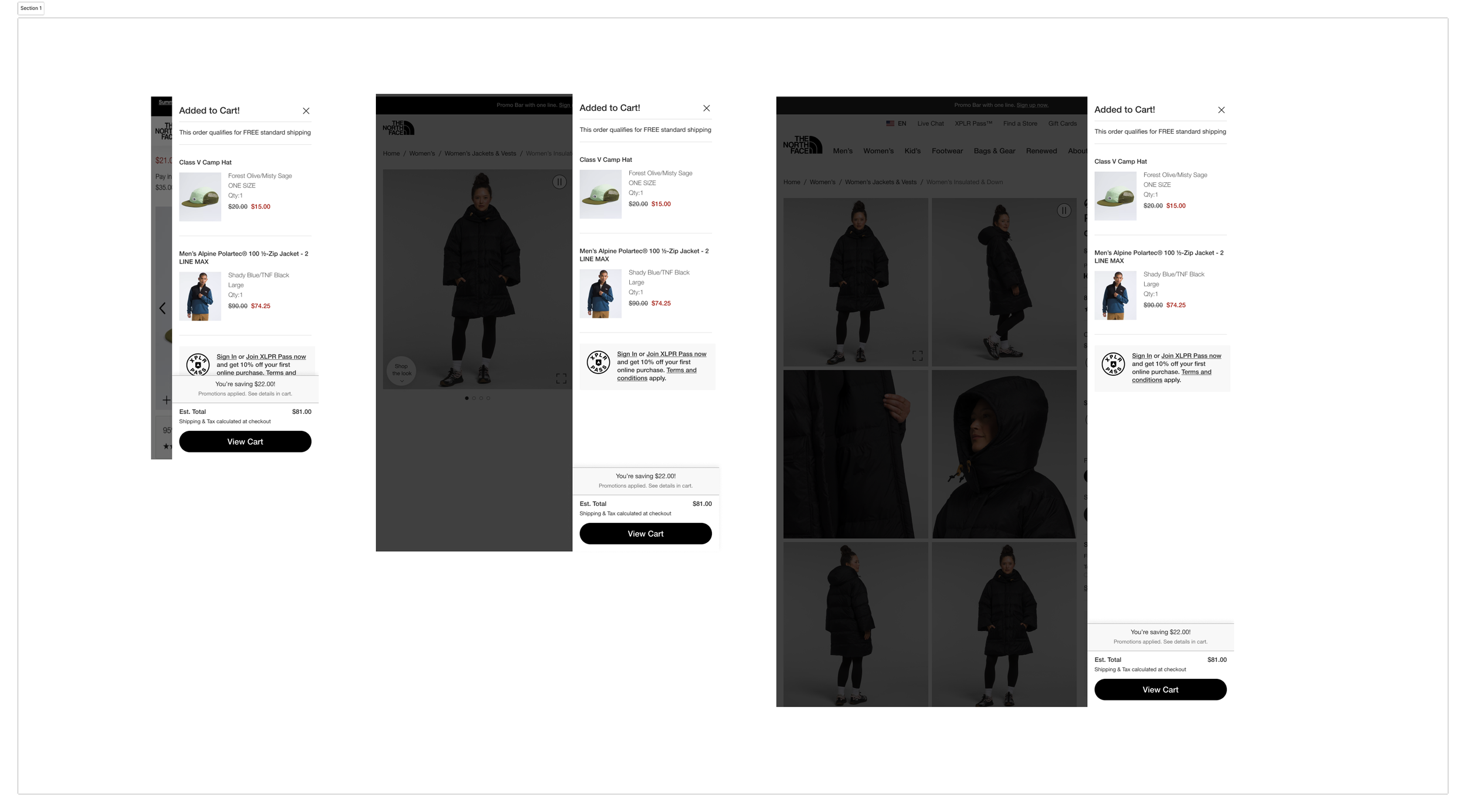
Enhancing Mini Cart Experience
Overview
As a UX Designer with experience in e-commerce, my mission was to address a critical issue on The North Face and Vans websites. Users reported frustration when trying to remove items from the mini cart, a feature designed for convenience but inadvertently creating friction. This case study details my approach to solving this problem, from initial research through to design, testing, and implementation.
Problem Statement
Users are unable to remove items from the mini cart on The North Face and Vans websites, leading to frustration and a disrupted shopping experience. The goal of this project is to allow users to easily remove items from the mini cart without redirecting to another page.
Objective
Create an intuitive design that enables users to remove items directly from the mini cart, following best practices and market insights. The design will undergo A/B testing to ensure that it improves user experience and meets key performance indicators (KPIs).
Approach
Research and Analysis
User Feedback: Initial user feedback revealed that users were confused by the absence of a clear “remove” function in the mini cart. This led to longer decision times, abandoned carts, and user frustration.
Competitive Analysis: I analyzed similar e-commerce platforms (e.g., Patagonia, REI) to identify how they address mini-cart interactions, especially around item removal. Most competitors had straightforward solutions like “X” icons, trash can icon, or “remove” text buttons.
Behavioral Insights: Research into users’ shopping habits revealed that mini carts are frequently used for quick adjustments, with users expecting easy control over item quantity and removal. Data from previous user interactions indicated that using an “X” icon for item removal can be confusing, as many brands use this icon to close the mini cart modal rather than to remove items, leading to unintended actions and frustration.
2. Defining Success Metrics
Conversion Rate: Increase in successful purchases by removing friction points.
Cart Abandonment Rate: Decrease in mini cart abandonment due to a more intuitive interaction.
Engagement Rate: Higher engagement with the mini cart as users feel empowered to manage their selections easily.
3. Design Process
Based on best practices, market insights, and user feedback, I developed several design options for A/B testing:
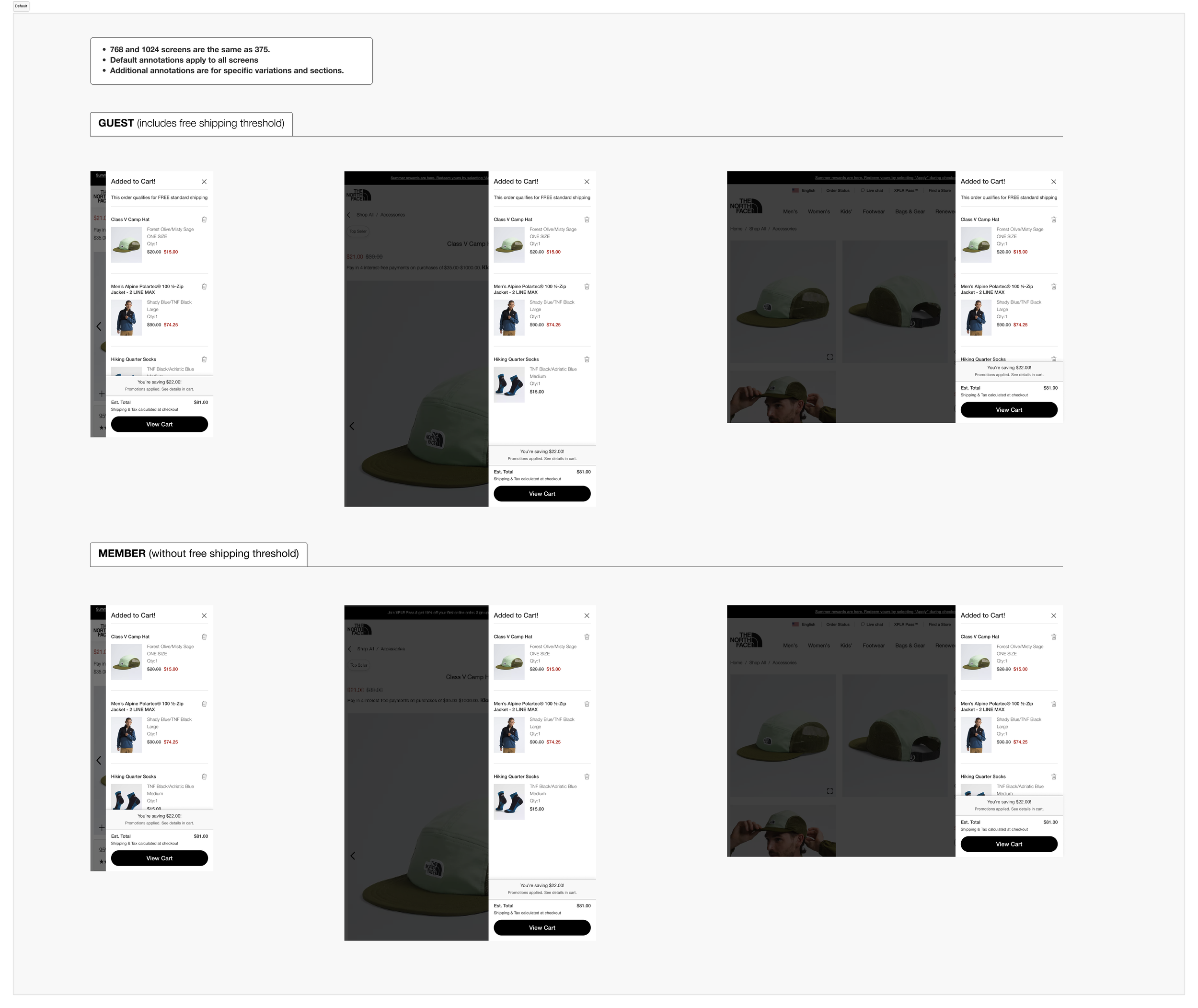
Option A: Trash Can Icon
A small trash can icon next to each item in the mini cart. The trash can icon is widely recognized as a symbol for deletion and may provide a clearer visual cue to users than a standard “X” icon, particularly in the context of e-commerce.Option C: “Remove” Link
A text-based “Remove” link is positioned directly beneath or beside each item in the mini cart. This option is explicitly labeled, minimizing the chance of user confusion. While it may occupy slightly more space, it offers clarity, especially for users less familiar with icon-only interfaces.
4. Prototyping and User Testing
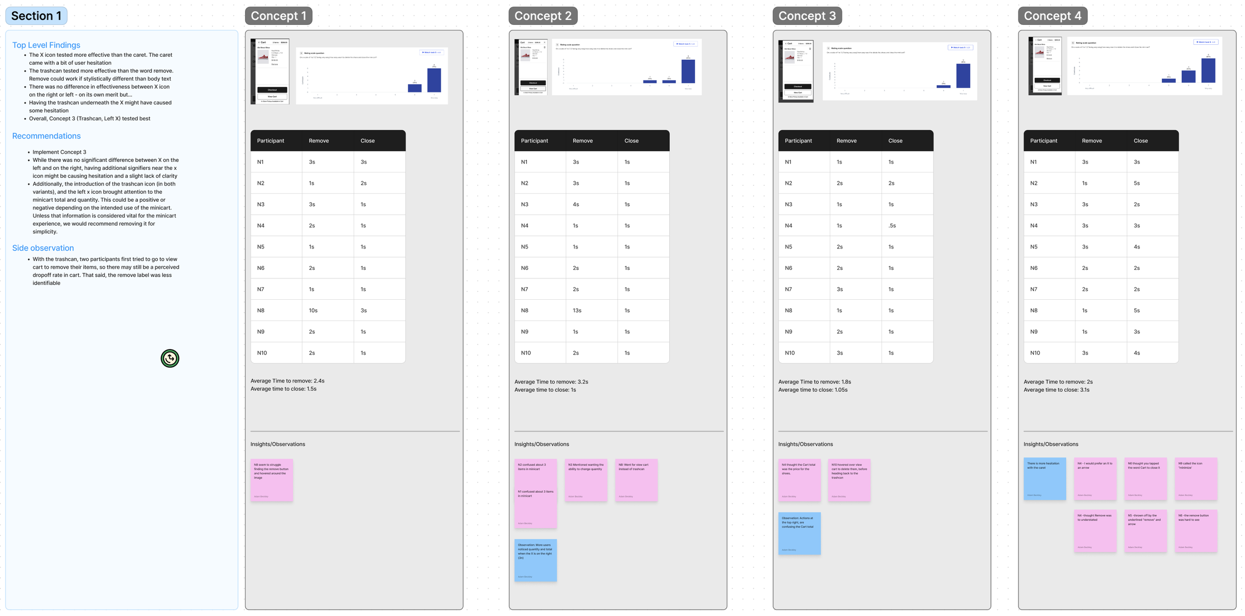
Both designs were prototyped and tested with a sample group of users to gather qualitative feedback:
Feedback on Option A (Trash Can icon): Users responded positively to the trash can icon, finding it intuitive for item removal. The icon was universally recognized as a delete function, minimizing confusion with the mini cart close button. Feedback from 10 participants showed that the average time taken to remove an item with this icon was just 1 second, highlighting its efficiency and ease of use.
Feedback on Option C (Remove link): Users appreciated the explicit nature of the “Remove” link, finding it clear and unambiguous. However, some found the text link slightly disruptive to the compact design of the mini cart. This option was particularly well-received by users who preferred text-based instructions over icons.
5. A/B Testing
We conducted A/B testing on the live website to measure the effectiveness of the two final design options:
Testing Parameters: Testing was conducted over two weeks, with users divided into two groups to see either Option A (Trash Can icon) or Option C (Remove link). Key metrics tracked included conversion rate, time spent in the mini cart, and cart abandonment rate.
Results:
Option A (Trash Can icon): This option performed the best, with a 17% reduction in cart abandonment and a 12% increase in conversions compared to the baseline. Users found the trash can icon intuitive for item removal without confusion over closing the mini cart.
Option C (Remove link): This option showed positive results, with users finding it clear and straightforward. It led to a modest 10% reduction in cart abandonment, though it slightly affected the mini cart’s compact layout.
Based on these results, the Option with the Trash Can icon was selected for implementation, as it offered the best balance of usability, clarity, and layout efficiency.
Conclusion
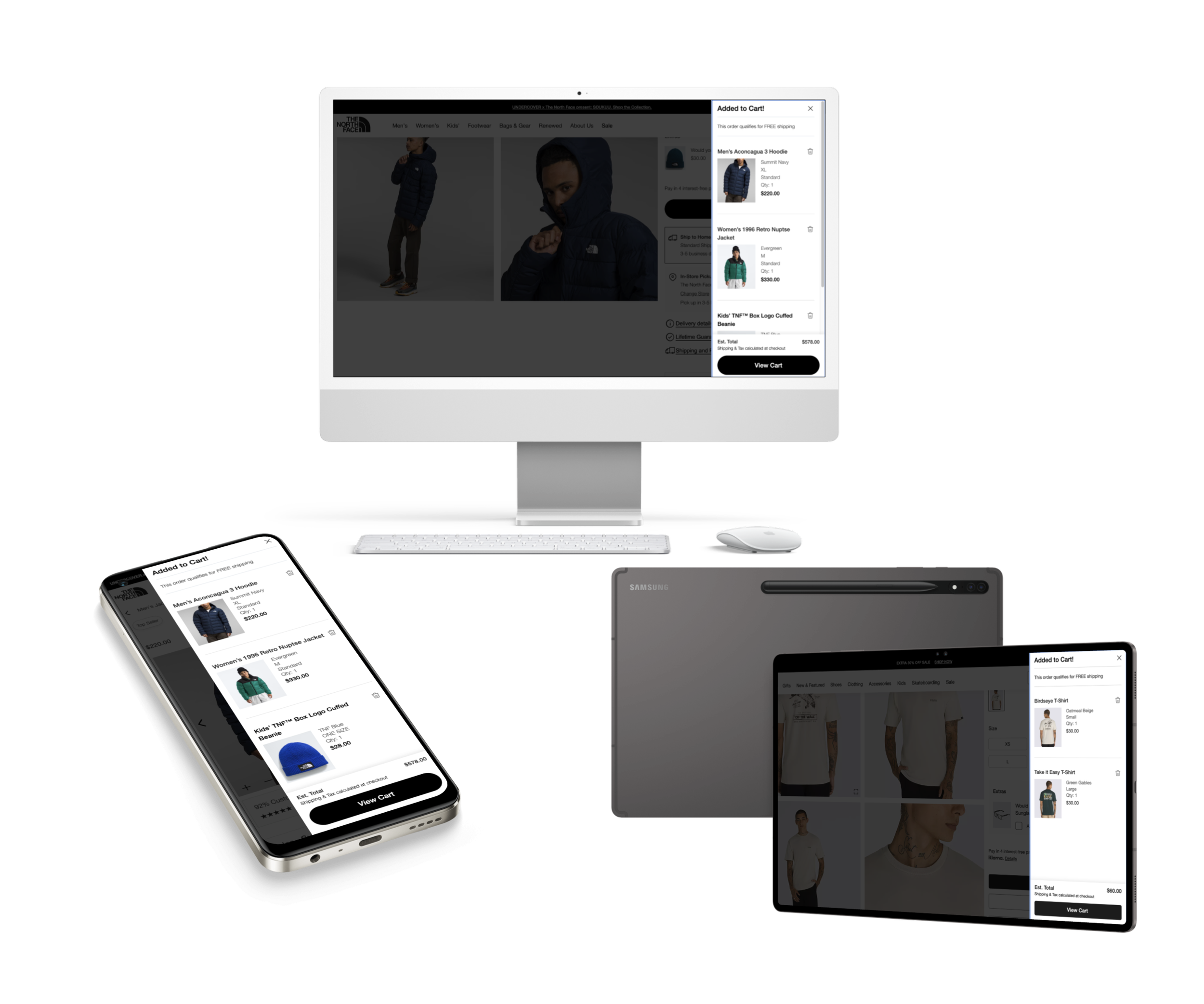
This project successfully improved the mini cart experience on The North Face and Vans websites, meeting user expectations for easy item management. By leveraging research, best practices, and rigorous A/B testing, we were able to implement a design that reduced cart abandonment and enhanced user satisfaction. The success of this project reinforces the value of user-centered design, iteration, and data-driven decision-making in creating intuitive e-commerce experiences.
Learnings
This project highlighted the importance of:
User Testing: Early user feedback was essential in validating design choices and ensuring we solved the right problem.
A/B Testing: Testing multiple design options provided a clear view of user preferences and guided the final decision.
Iterative Design: Following the initial implementation, minor adjustments to accessibility and icon visibility helped further improve the user experience.
This case study exemplifies my ability to identify and address user pain points, apply market insights, and drive impactful changes through research-driven UX design and testing methodologies.


